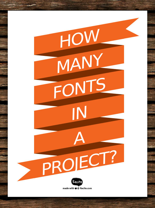
Although there are no absolute rules when using fonts in a design project, it is advisable to use no more than three fonts. More than three causes confusion and a jumbled design mess.
The body of your project should remain consistent, remember to always use the same font throughout. Select a different font for your headlines, and sub-headlines if you want to. It’s OK to use bold, italicised, and different font sizes for your headlines.
Your project’s font should always be readable. It is alright to use a script or decorative font for your headlines. Verdana is good for web copy, and Times New Roman is a readable font that works well with print body copy.
I’ve seen many blogs that use a script font for the body, and not only is it hard on the eyes it presents an unprofessional appearance. Remember, when it comes to design “less is more.”